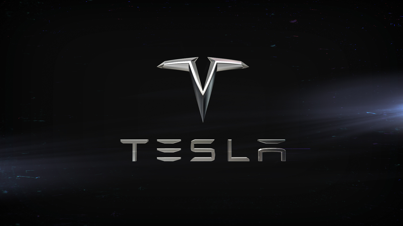
In some of my concepts project I always try to change something, why?, it easy. because I don't like it, how it looks and etc. With the Tesla logo the same problem. I think the existing logo that company uses looks unserious and cheap for company that makes revolution in autoindustry. I suggest another version of it, it just my personal project.
Symbol
At first I tried to set lines around the existing logo, and noticed a lot of mistakes
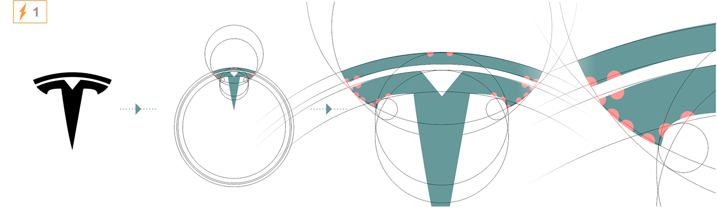
Then I tried to find data, what does logo means, and found only assumptions of some people, here.
Daniel Fourie, says: The Tesla Motors logo reminds me of a cross sectional view of one pole of an electric motor. In this way, the puzzling split in the cross of the T is easily explained by the air gap between the rotor and the stator. (The orange stripes are the wire windings on the stator poles, and the purple represents permanent magnets.) However, both the Tesla Roadster and Model S use an Induction motor (pic 2. image from quora.com)
Ashwinn Krishnaswamy, says: If you look carefully, the T looks like Nikola Tesla's face: The logo is a tribute to his dour demeanor. (pic 2.1)
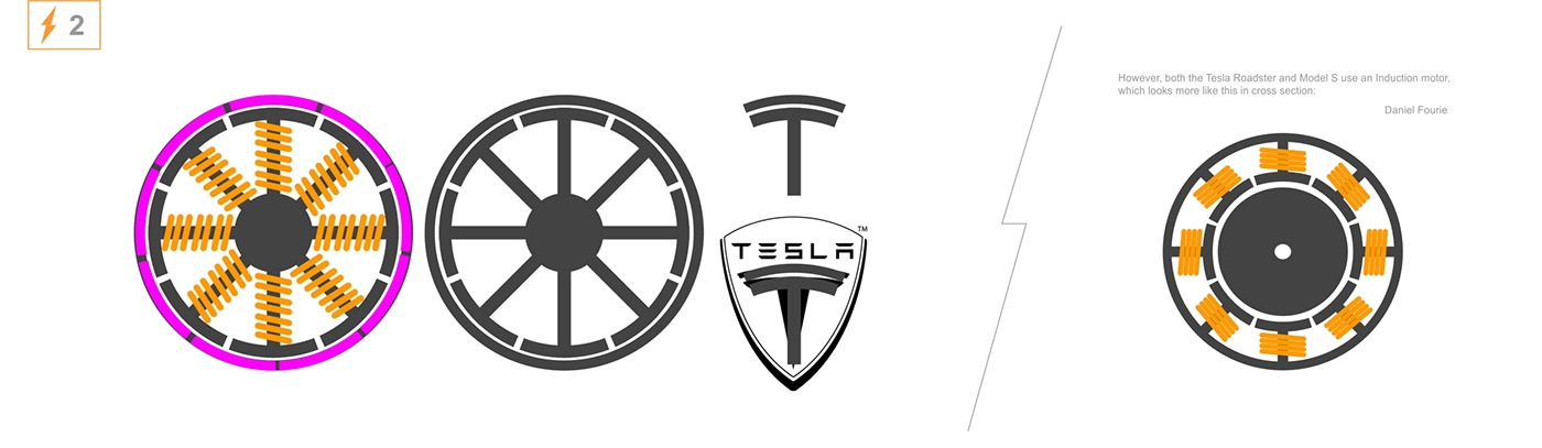
pic 2.1

Three things relating with Tesla by my viewpoint.
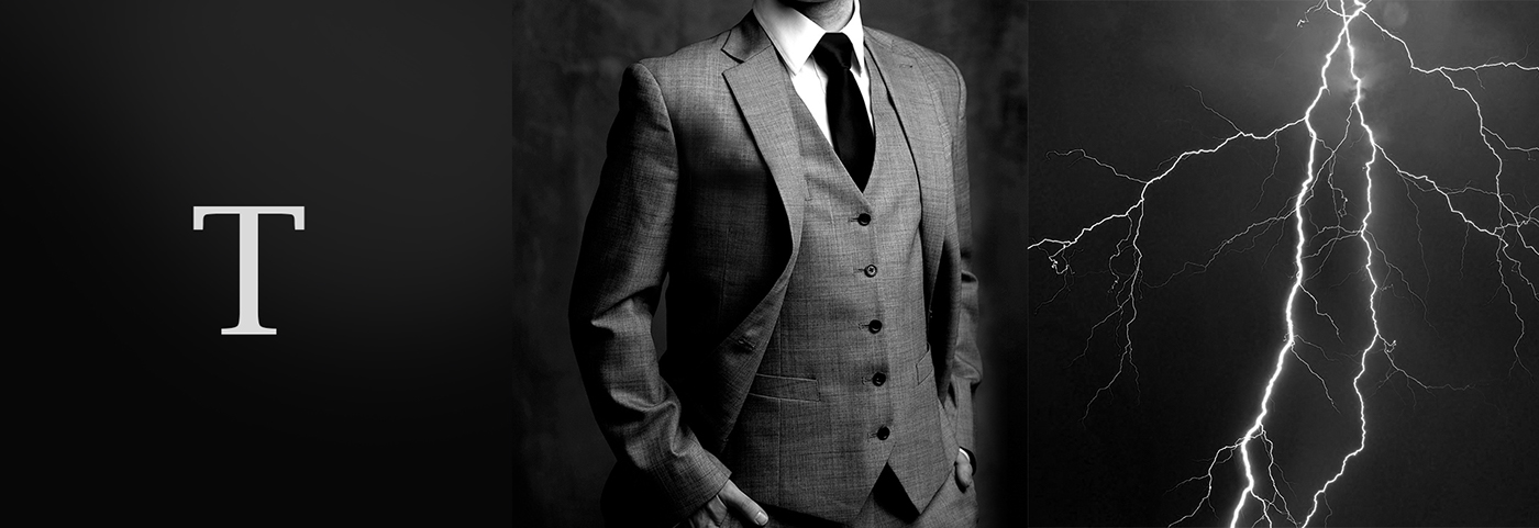
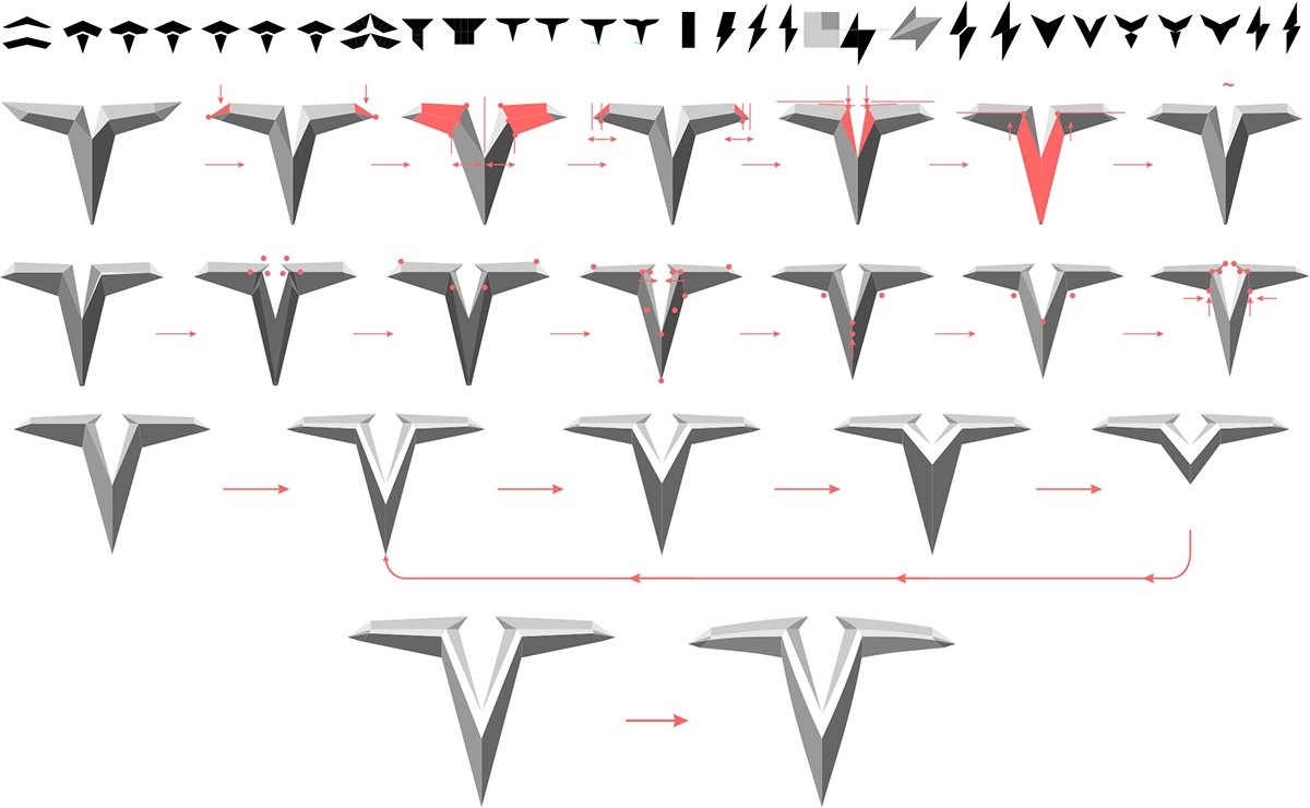
My vision


Key

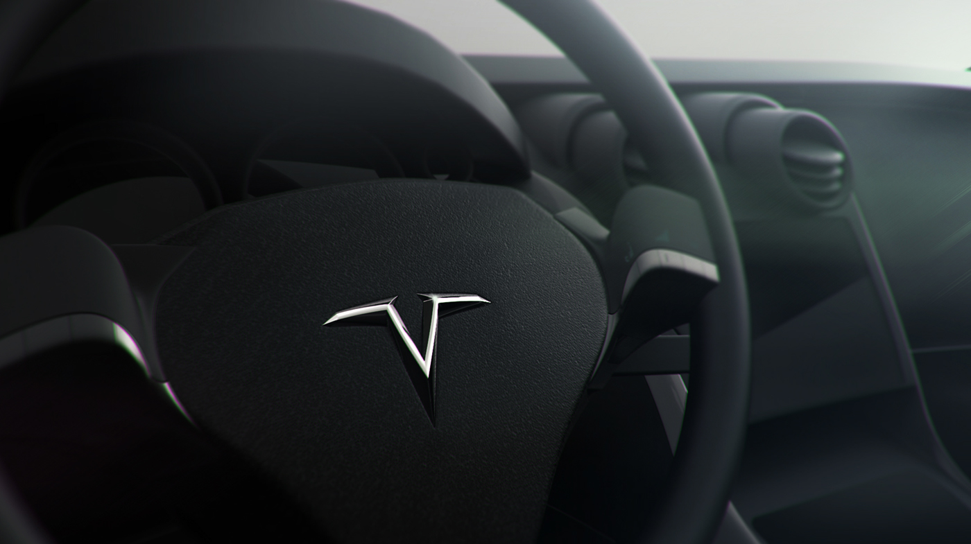
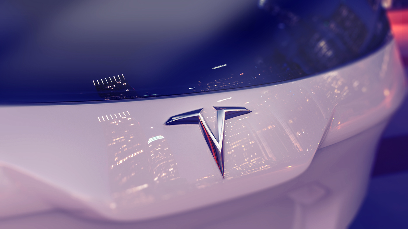
Back side on car
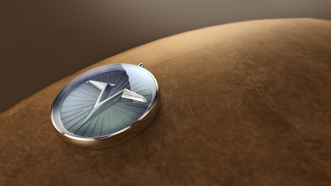
Souvenir - based on Tesla coil


Lettering